

As discussed in my last blog post, Simon and Kirby published some of Ditko's earliest comic art. One such story appeared in Black Magic # 27, Nov-Dec 1953.
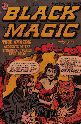


Cover to Black Magic # 27 by Jack Kirby; letters by Ben Oda. Very likely inspired by the atmospheric 1942 movie "The Cat People" directed by Jacque Tourneur. The cat on the right is actually Yancy Streeter Barry Pearl's cat "Kirby", who enjoys wearing scarves and tee-shirts.
Along with work by Kirby and Bob McCarty, Steve Ditko drew a six page story, "A Hole in His Head". For a young talent Ditko turned in atmospheric scenery and strong character faces, which would only improve over the years. What's interesting is the stone age creature that shows up and wreaks havoc with our cast.

Page 4 of "A Hole in His Head" by Steve Ditko; letters by Ben Oda.
With the appearance of the stone age creature, someone, either Simon or Kirby, didn't think Ditko's version was dramatic enough and replaced his figures with those of Jack Kirby.

A detail of panel 2, introducing the stone age creature. Kirby's hand is evident in the pose and musculature. Kirby's figure is likely more imposing than the one Ditko originally drew.

Panel 3 detail. Again, a distinctive Kirby pose.

Page 5 includes one unaltered Ditko creature. Can you guess which one?

Clearly a Kirby face and figure in panels 6 and 7. The hand in panel six is possibly by Ditko.

Detail of panel 3 by Ditko. Here the figure looks less imposing, although the face may have been altered. Kirby's creature is more solid and powerful looking, not unlike some of the monsters he would draw a few years later on Marvel's pre-hero line. Kirby's stone age creature in this story reminds me of "The Abominable Snowman" he drew, which, if I recall correctly, was inked by Ditko. In that same period Ditko would specialize in weird aliens and moody stories. Both men were well-served drawing their own particular brand of suspense.

The last page features the creature in only one panel. And if the story didn't frighten you, the ugly pimples that the ad refers to might! As revealed by Blake Bell, who had the stats to the story, the ad replaced a final panel, although there was no Ditko art to be seen (is this how the Missing Man started? Take a look here for the story:

close-up of Page 6, panel 1, which looks like another Kirby illo.
This early Ditko story is an example of alterations that often occurred in comics. When editors were not pleased with the art on a particular page, figure or panel they would institute changes, often asking an artist other than the original to make the corrections.Sometimes they decided to change an ending, as in this story, and alter or delete a scene. This was often done due to time constraints, so if another artist or someone on staff was available, that person would make the change. This often led to a rather jarring stylistic jumble that wasn't always appealing.
Whether it was Simon and Kirby or Stan Lee, editors had their own view of what sold, or of a distinctive look they wanted. Covers, in particular, were of paramount importance, and many were altered before the final product was allowed on the stands (some changes were demanded by publishers). For those of us looking from the outside, the changes don't always make sense, but the bottom line was sales, or what those in charge perceived would sell. Comic books are a business, and unless an artist is in complete control of his work there are always others who, for good or ill, will have the final word.


Nhận xét
Đăng nhận xét